Designing Panacea : A Clothing Brand Inspired by the Relentless Pursuit of Greatness.

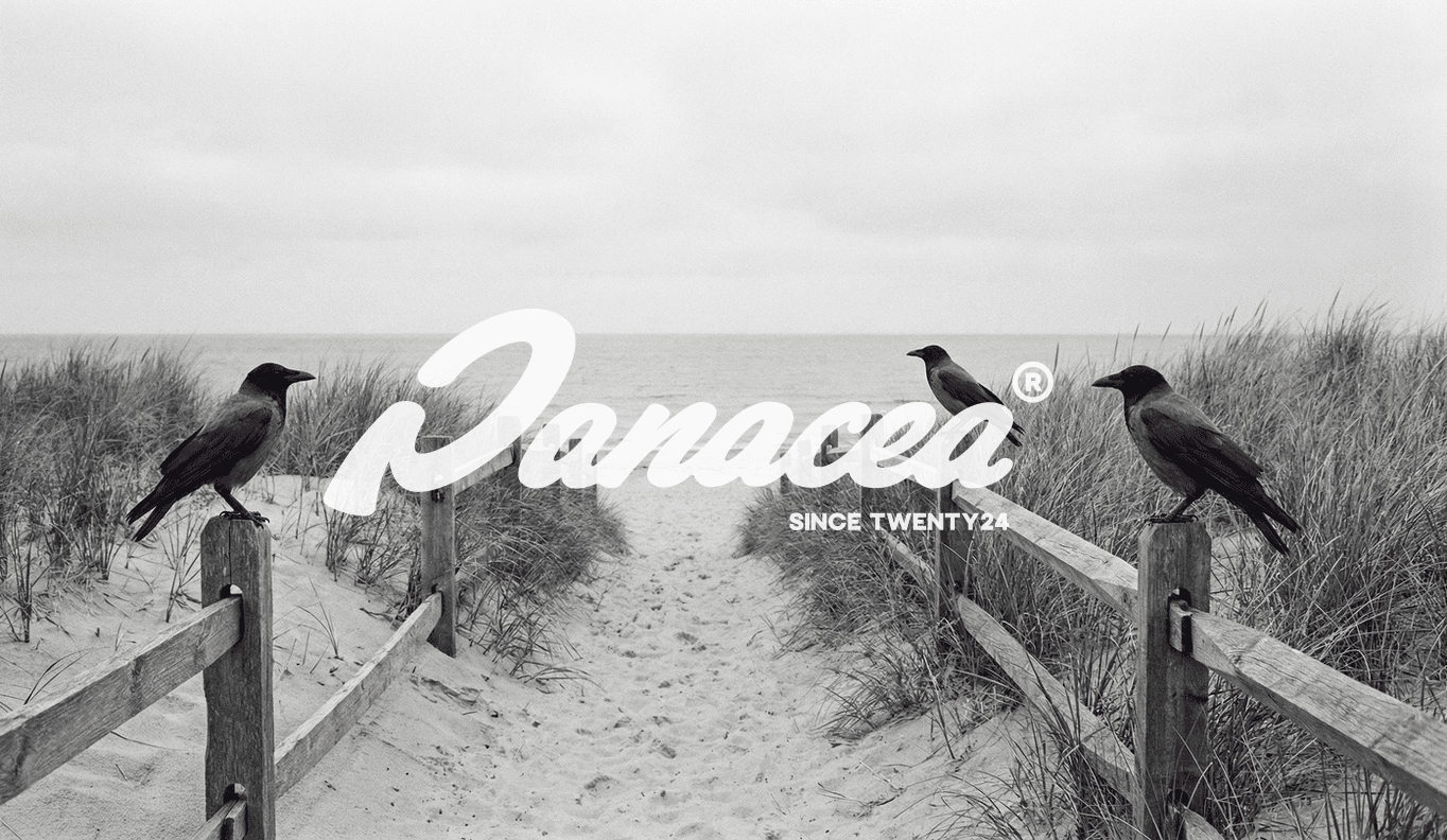
Panacea - The award-winning logo redefining the modern cure for everyday apparel.
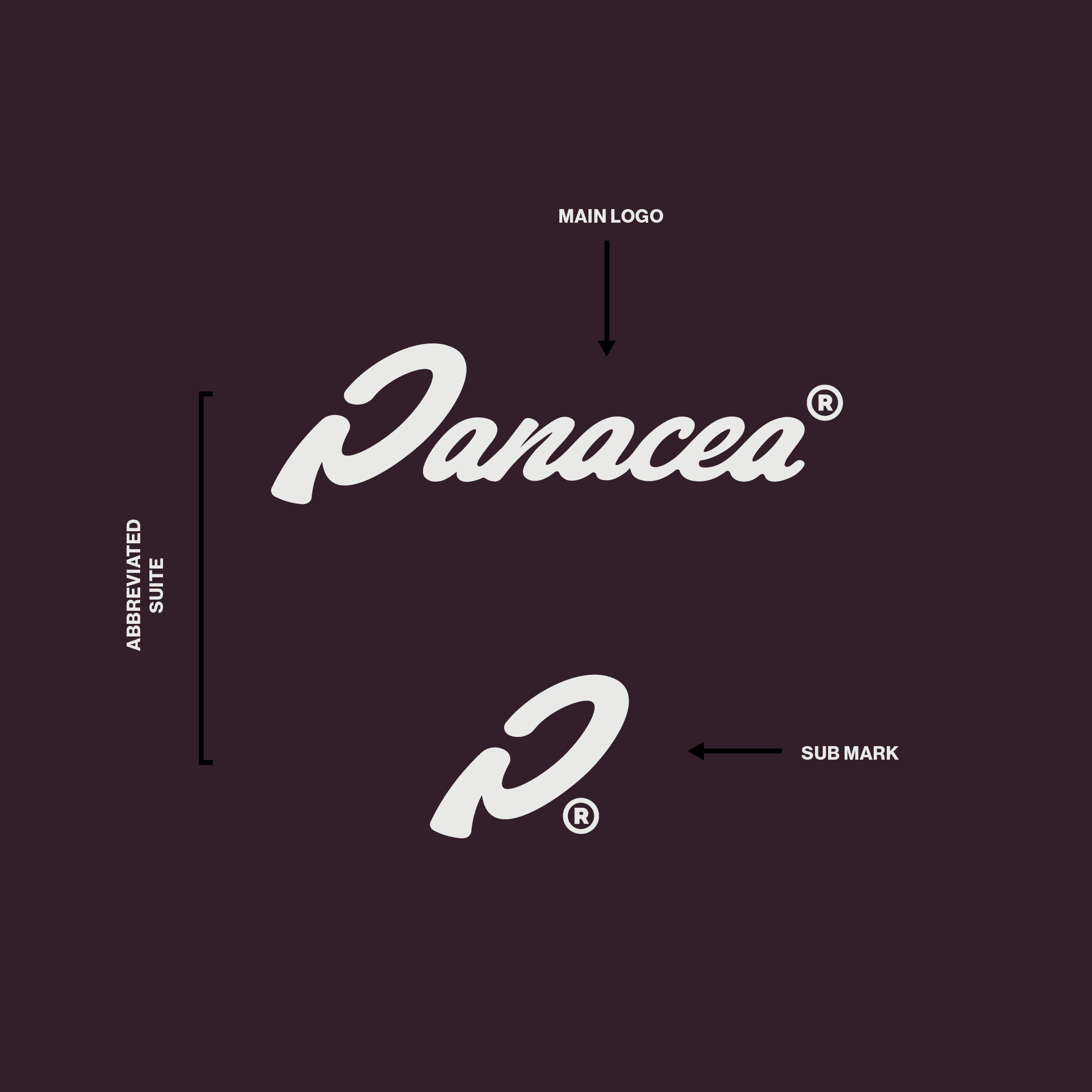
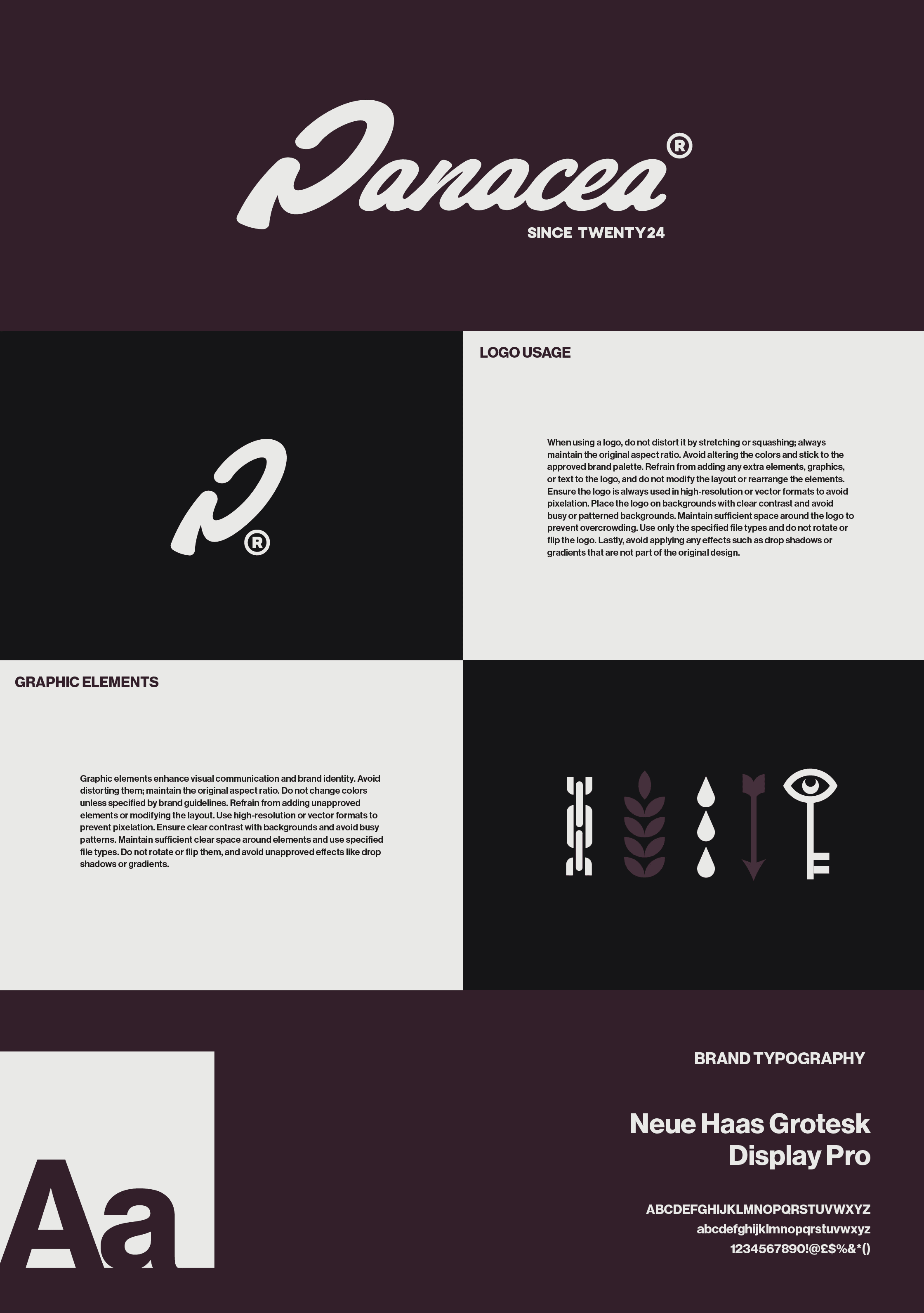
At its core is a hand-lettered logotype, human, confident and intentionally imperfect, paired with a restrained visual system designed to feel calm, grounded and enduring. Muted tones, considered typography and understated iconography work together to create an identity that feels both refined and accessible.
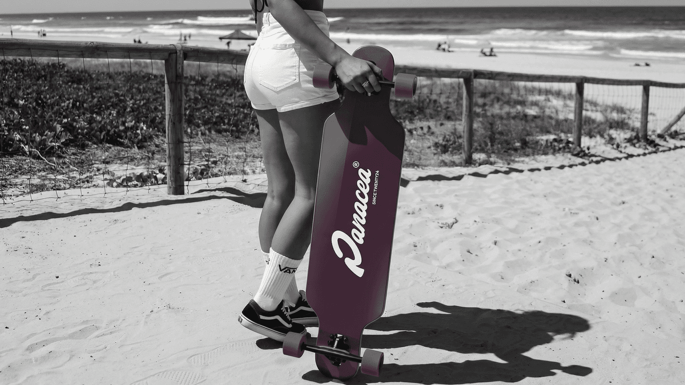
Across apparel, mobility and storytelling, Panacea presents a quieter alternative to fast, disposable brands. A lifestyle shaped by movement, ritual and intention, designed for those seeking clarity in the everyday.
• Brand positioning defining Panacea as a slower, more intentional lifestyle, built around movement, ritual and considered living
• Hand-lettered logotype and sub-mark acting as a badge of belonging rather than overt branding
• Flexible identity system designed to live naturally across apparel, mobility and physical spaces
• Colour and material direction focused on calm, maturity and long-term attachment
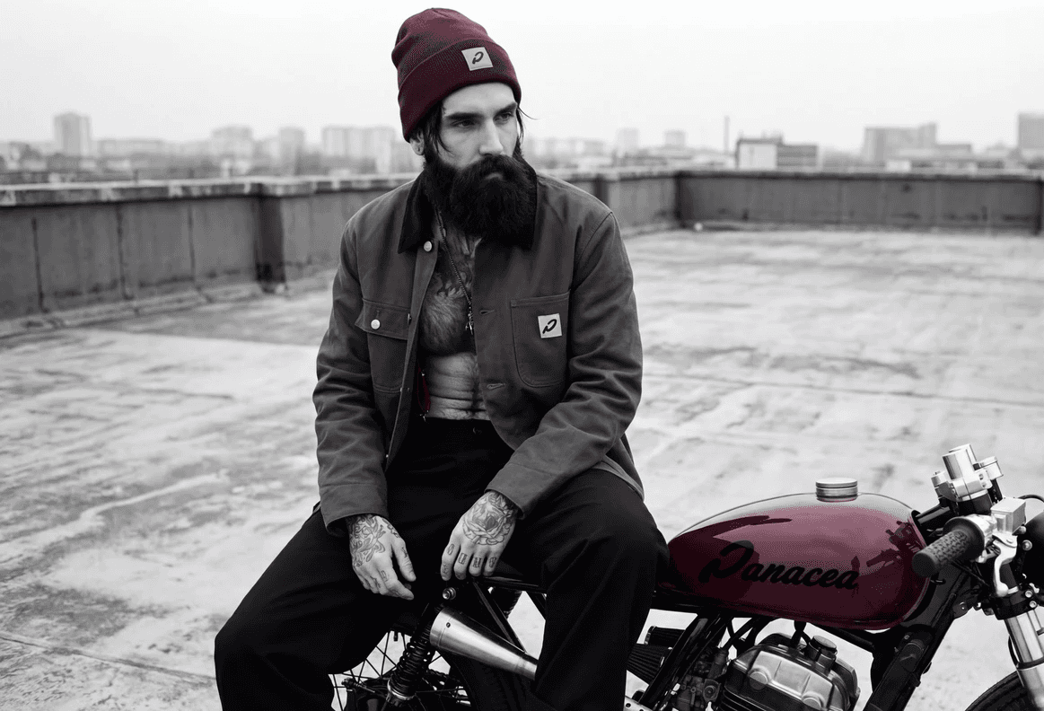
• Apparel and accessories mocks designed for, familiarity and organic brand visibility
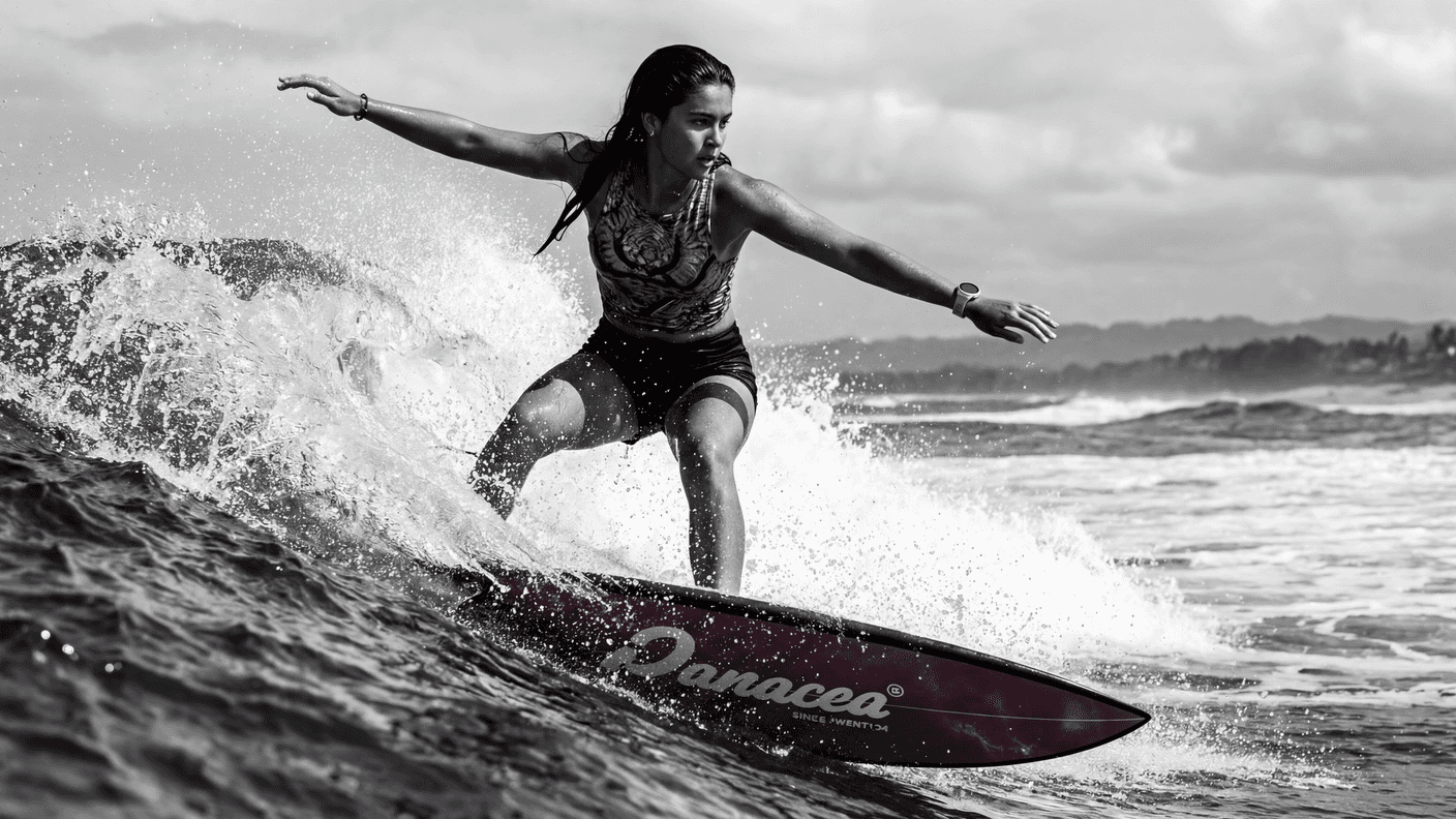
• Vehicles and boards used as lived storytelling assets, extending reach through experience rather than advertising
• Physical environments and signage establishing permanence, trust and real-world presence