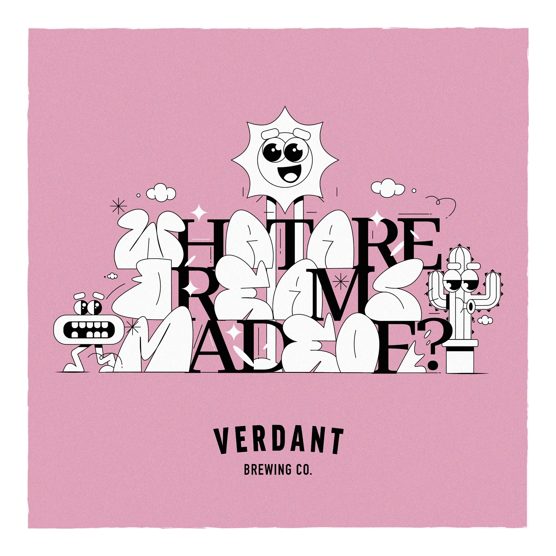
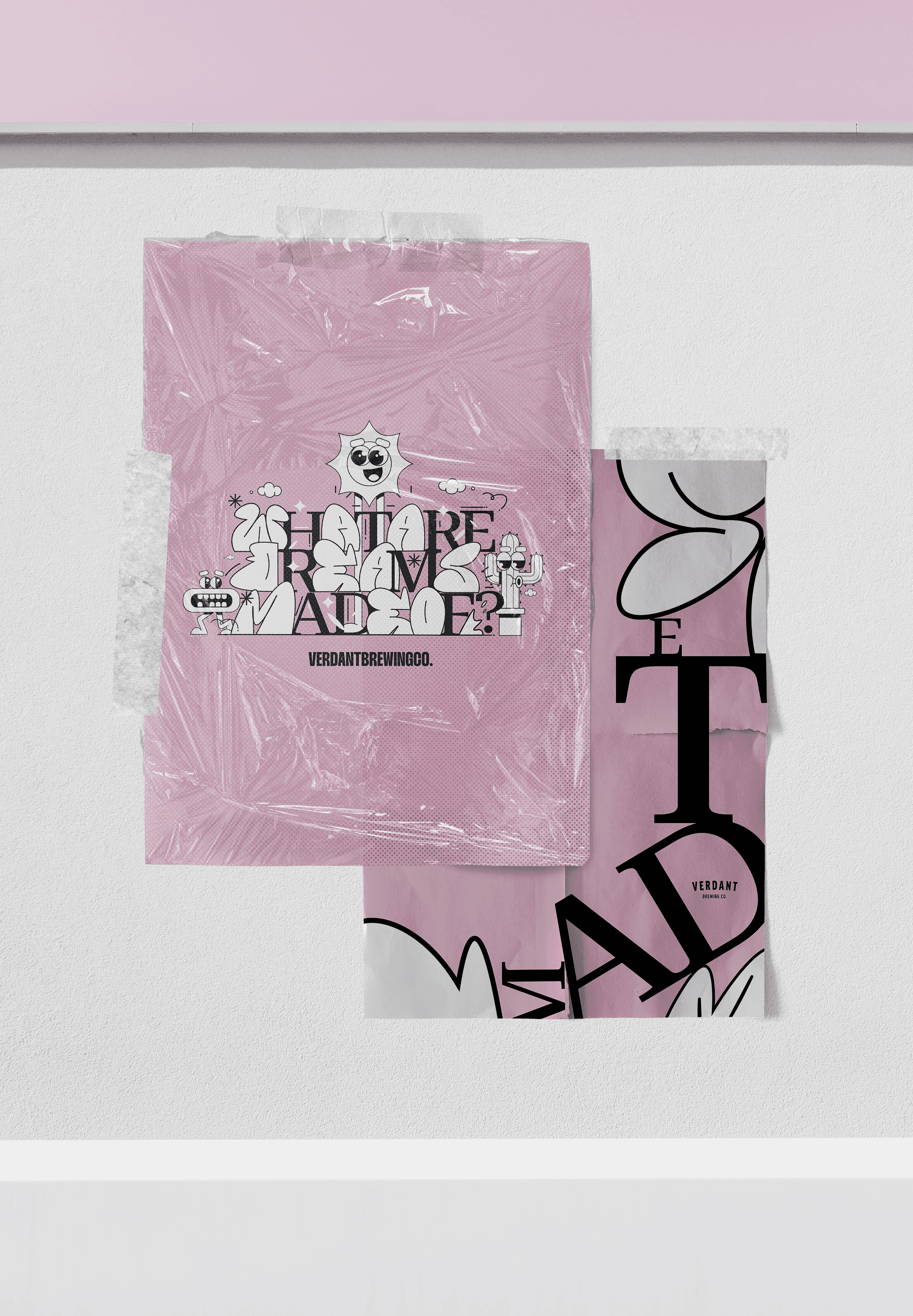
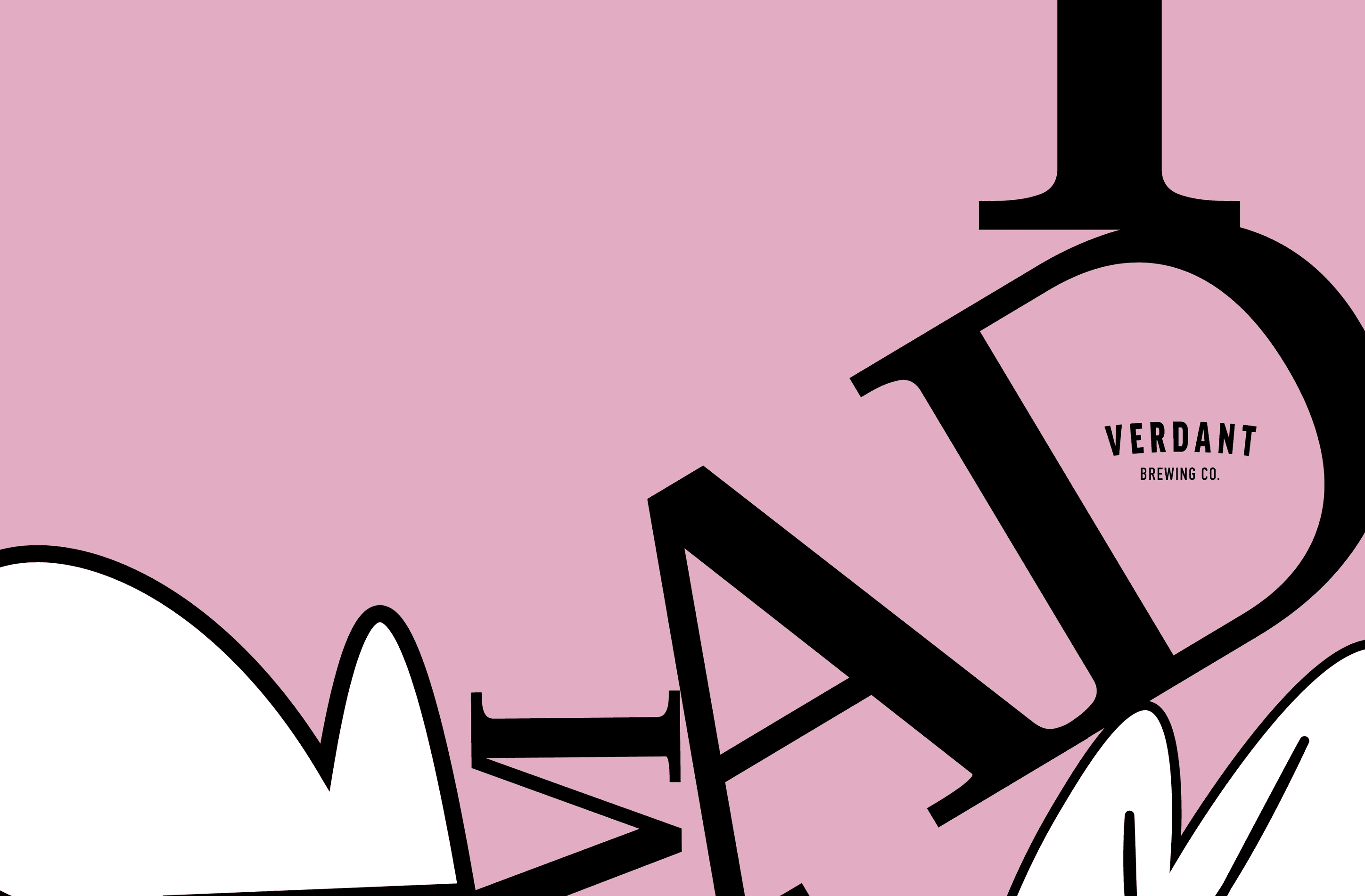
a designer's journey: crafting the "What Are Dreams Made Of?" Double IPA label with two separte directions.
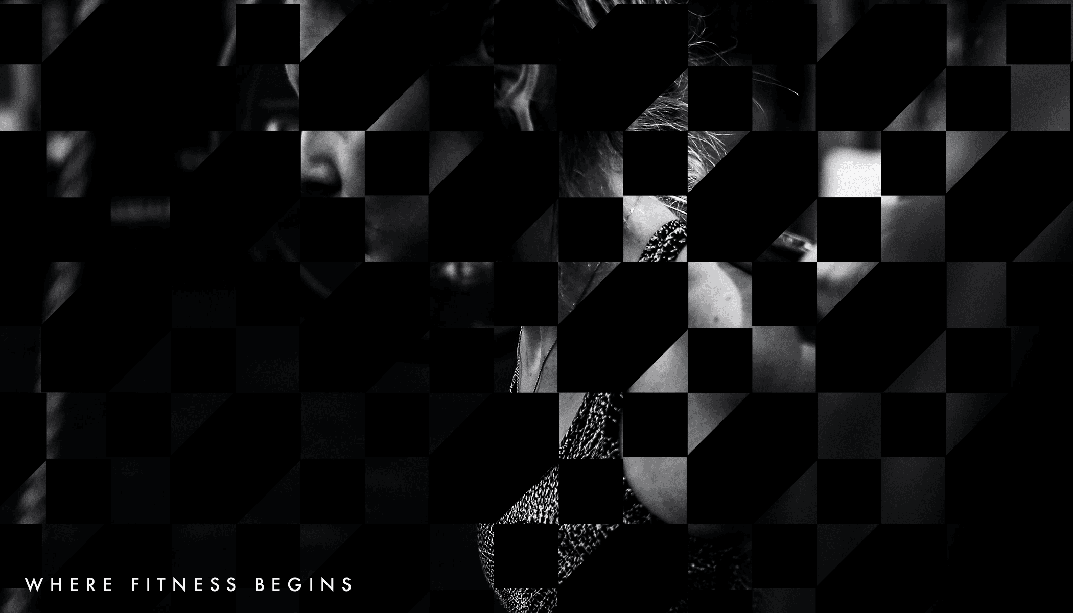
Where fitness begins
Mark and Kate's successful business model and lifestyle in Bristol's Origin led to rapid growth in their fitness empire. As their business expanded, it became evident that the original logo needed an update to represent their ambitions and future trajectory.
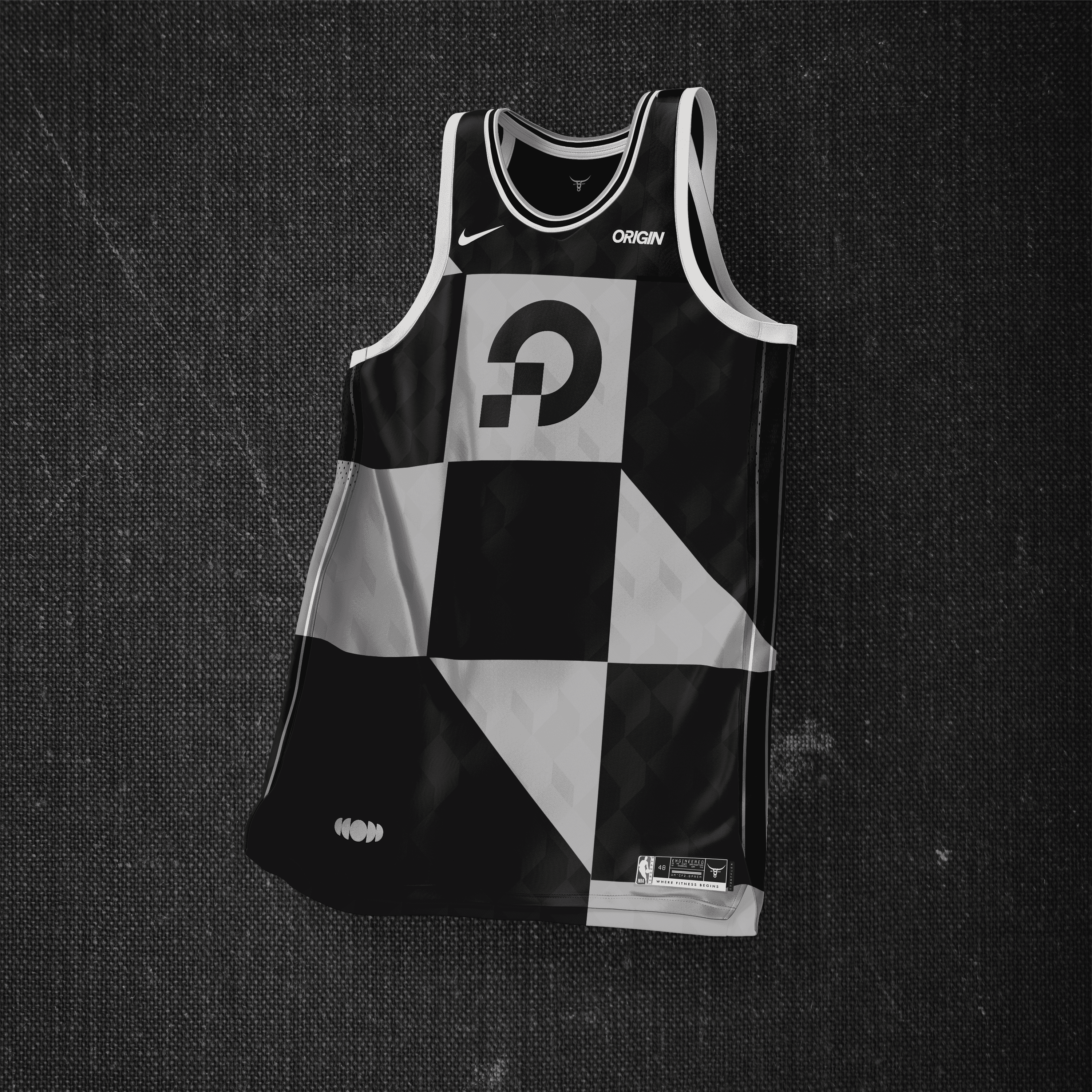
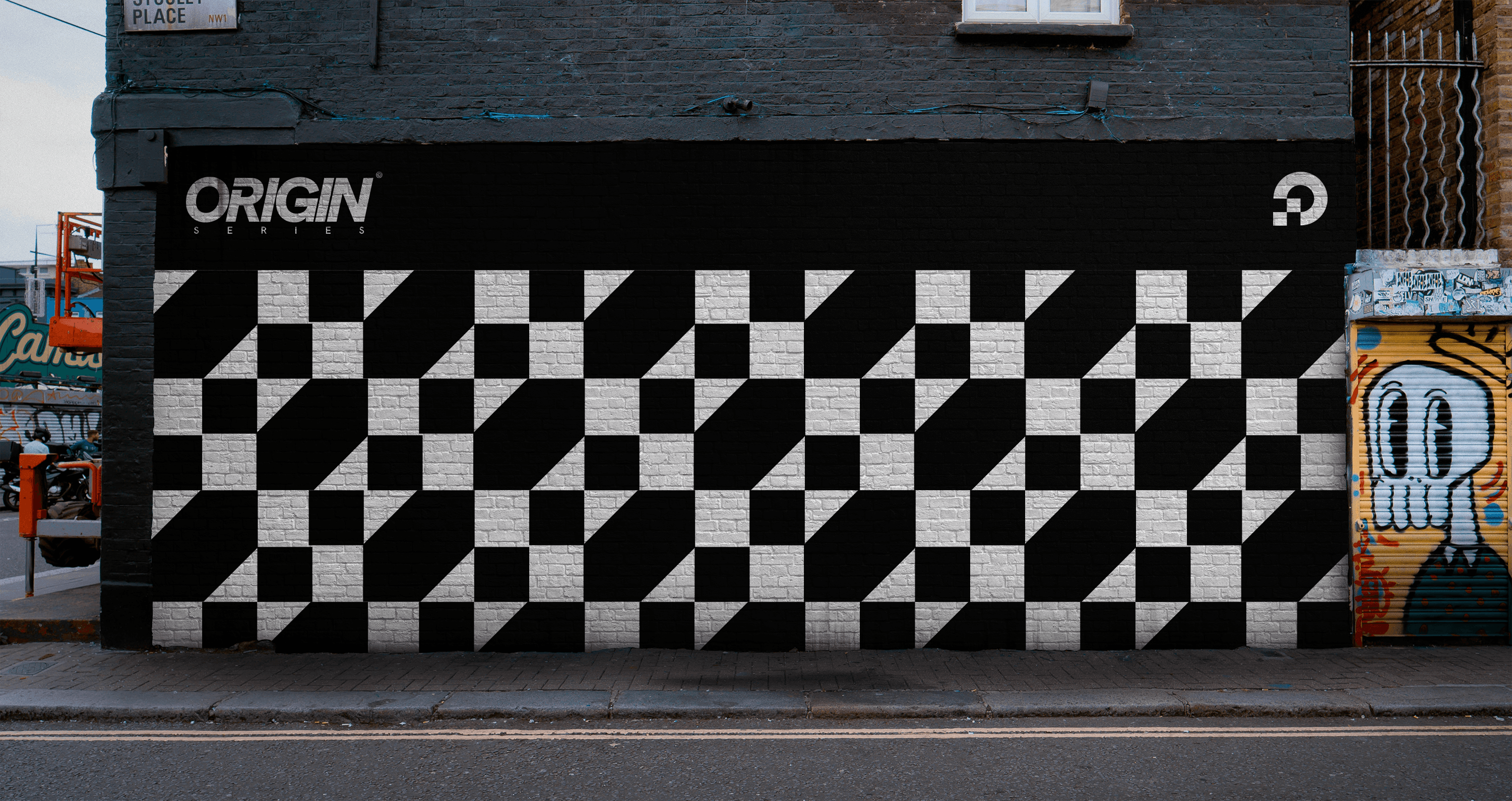
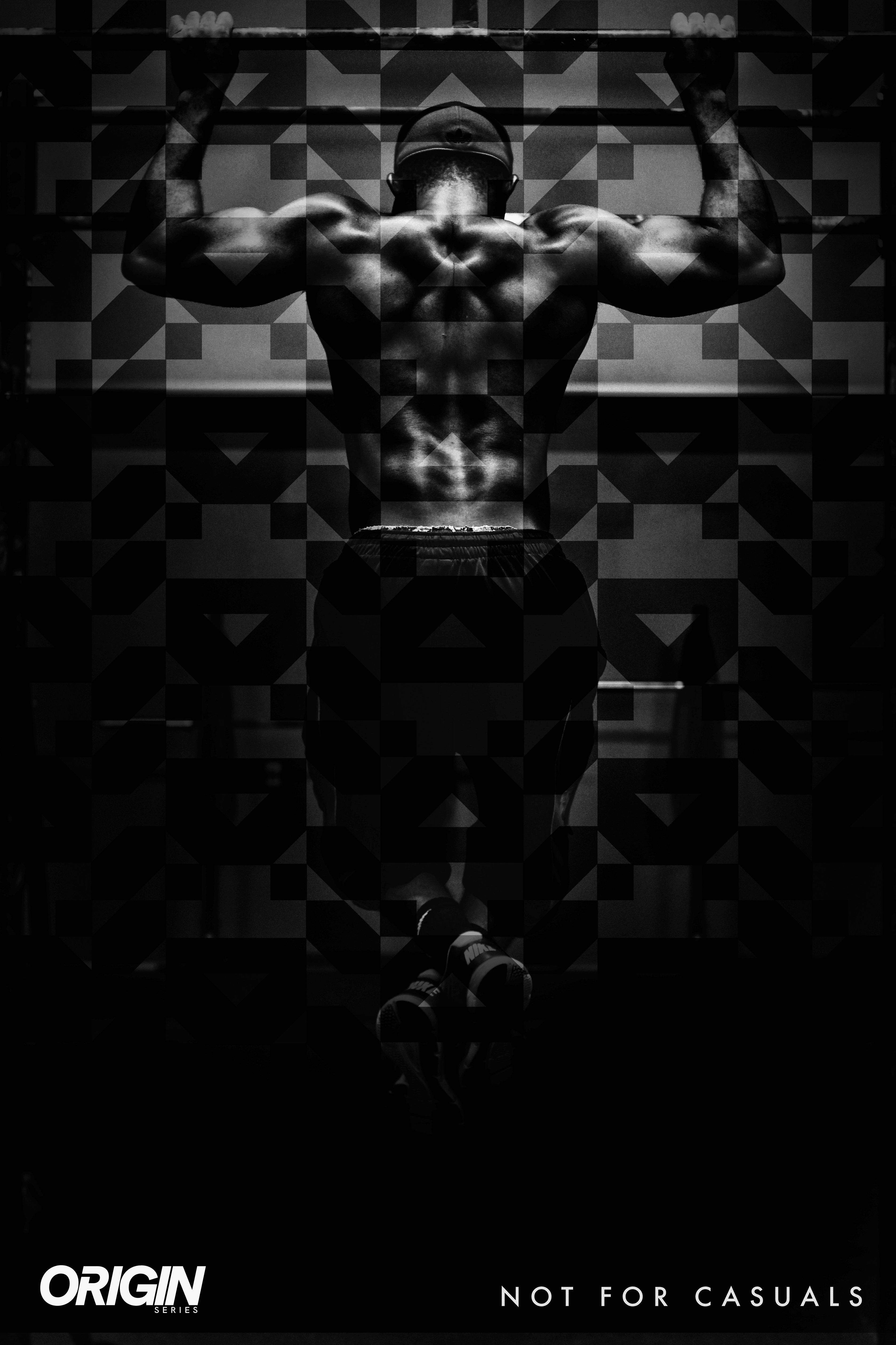
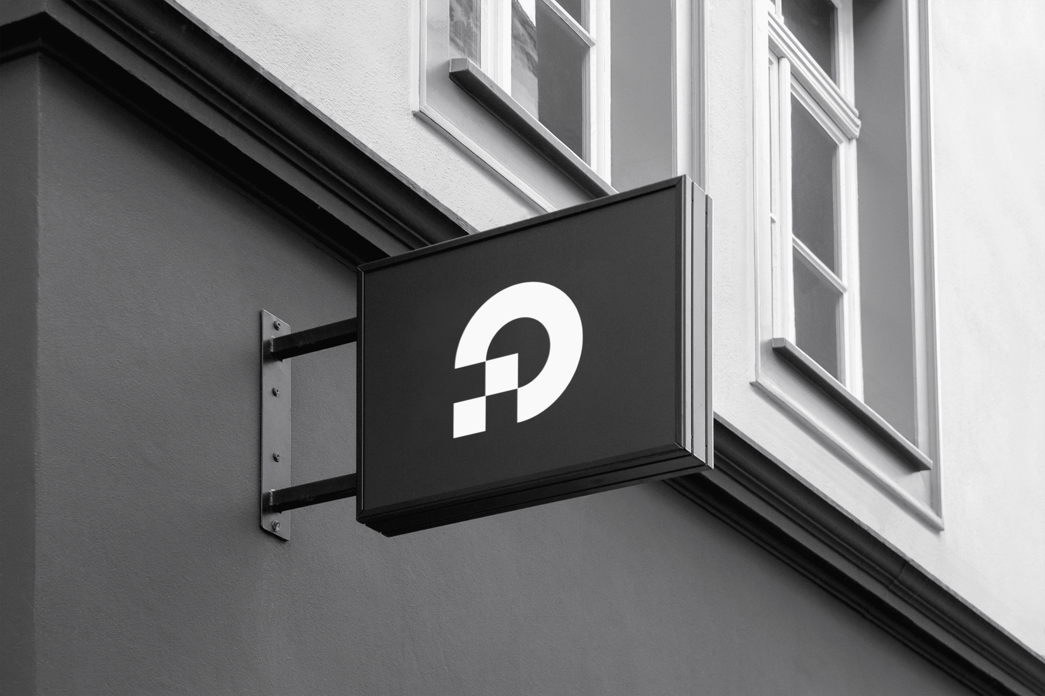
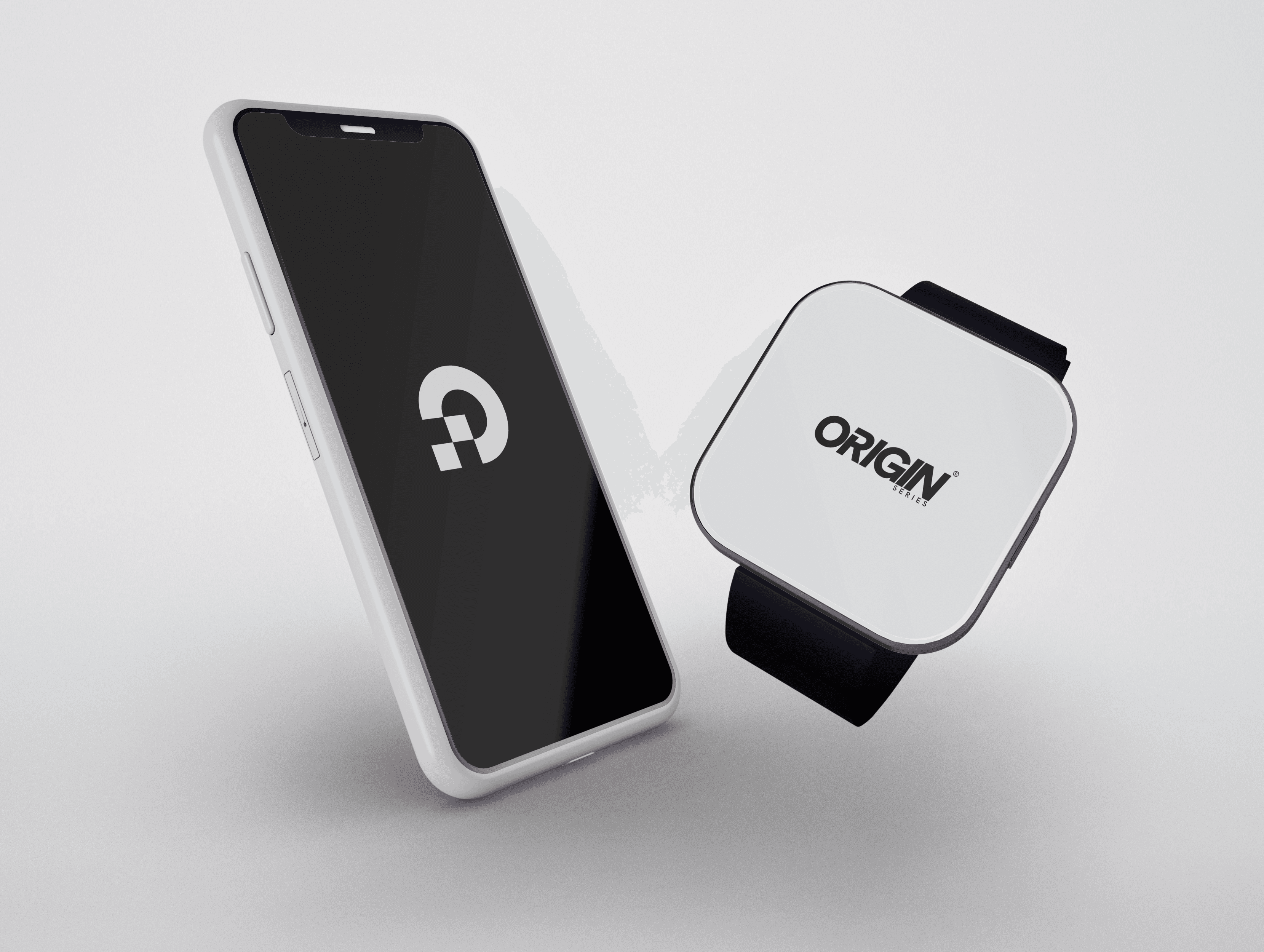
To carry them forward, I crafted a new flagship logo that conveyed intention, foundational movement, and repetition, while also exuding the polished image befitting Origin's status. The visuals now align perfectly with Mark and Kate's vision.
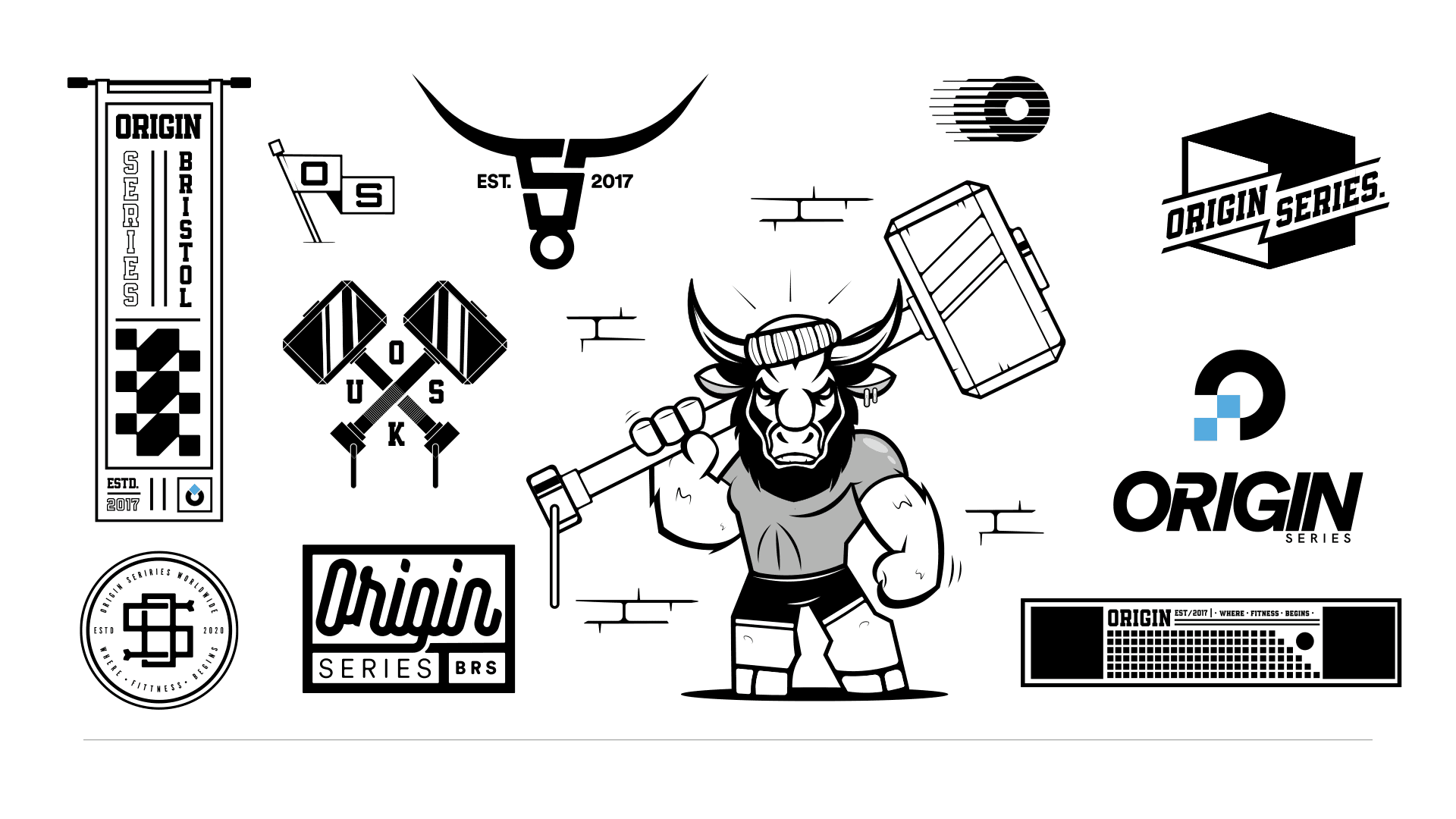
Expanding on the logo, I designed the entire identity, infusing it with the company's ethos to create a cohesive brand representation. Additionally, I illustrated a flash pack for their launch merch, resulting in a fantastic project with incredible clients!